
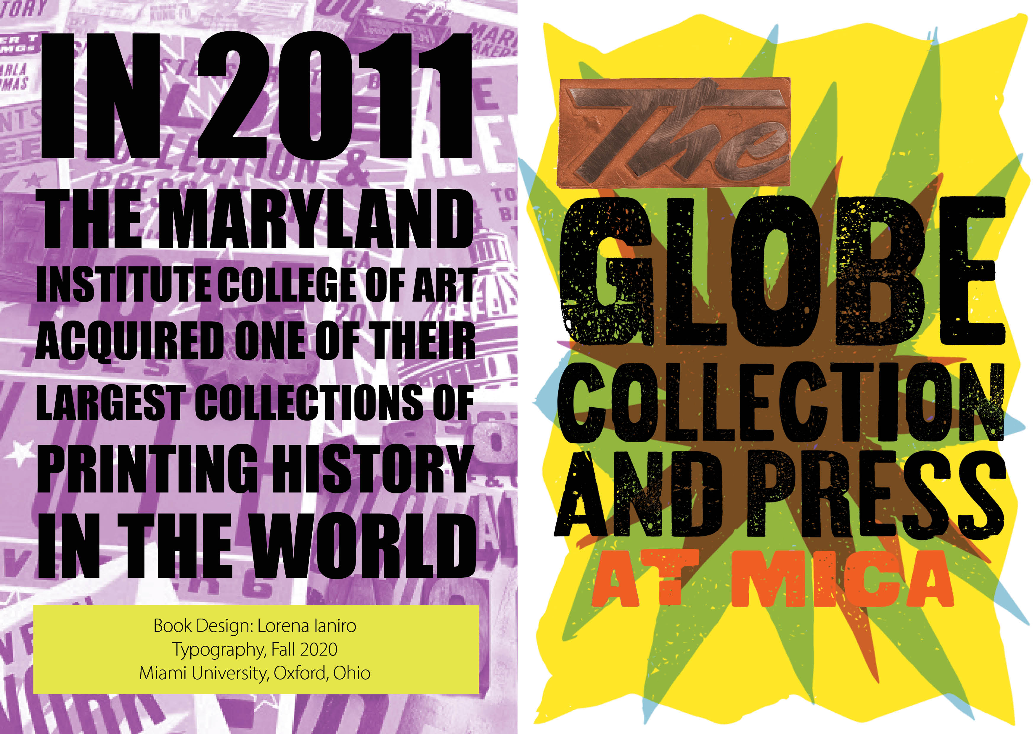
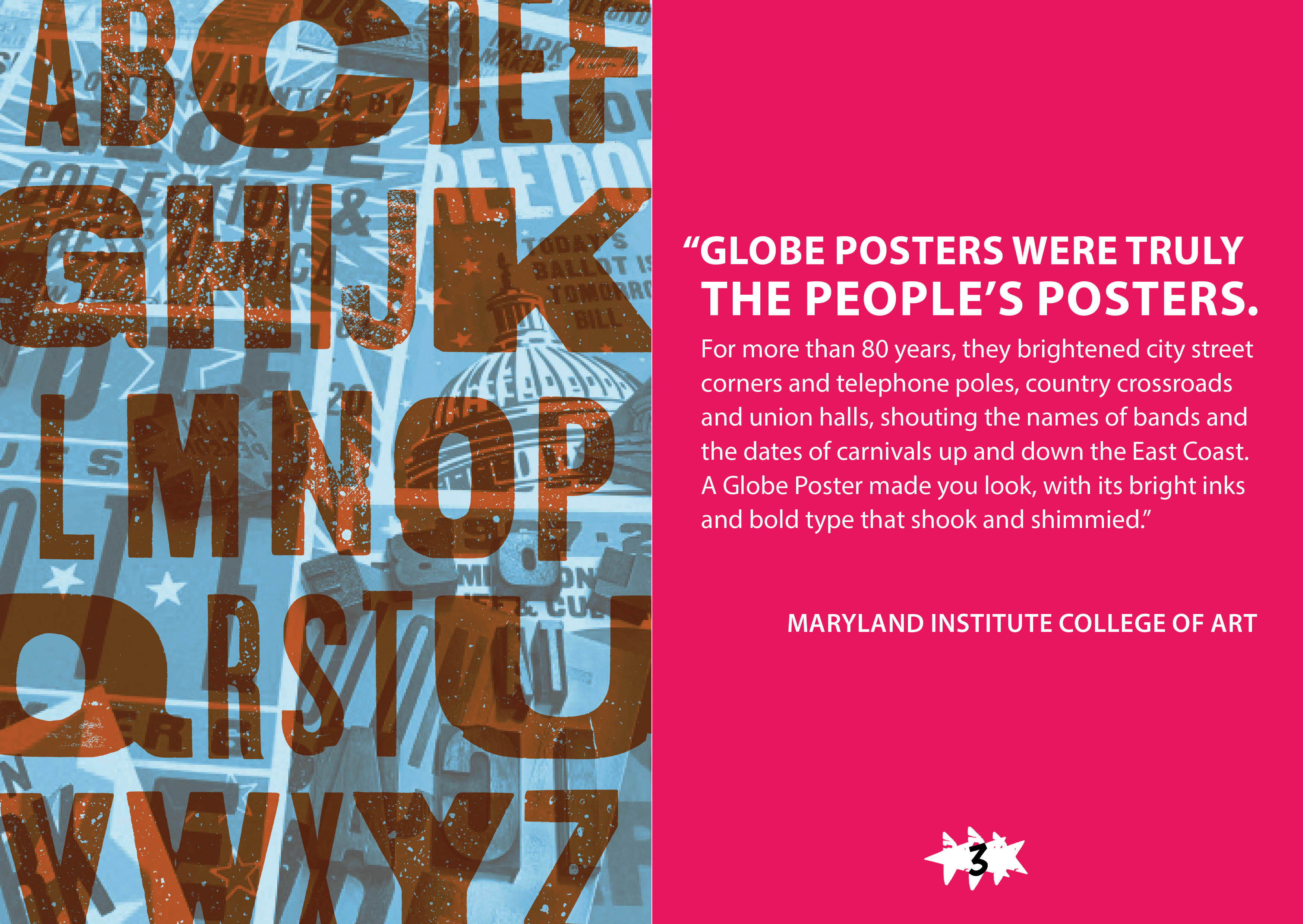

In this assignment, my classmates and I were each assigned a different letterpress printer or shop and then asked to create an informative booklet about the printer or shop in a way that honors its style. Creating these booklets would expand our knowledge of prominent figures in the letterpress printing community. I was assigned the Globe Collection and Press. Globe is a press located in the Maryland Institute College of Art, and they are known for their neon colors, bold designs, and a rich history serving performers and musicians.
The first part of my research involved online investigation including Globe’s website and Globe’s official Instagram profile. I gathered an assortment of typefaces and colors used prominently in their work to get a feel for their visual brand identity.
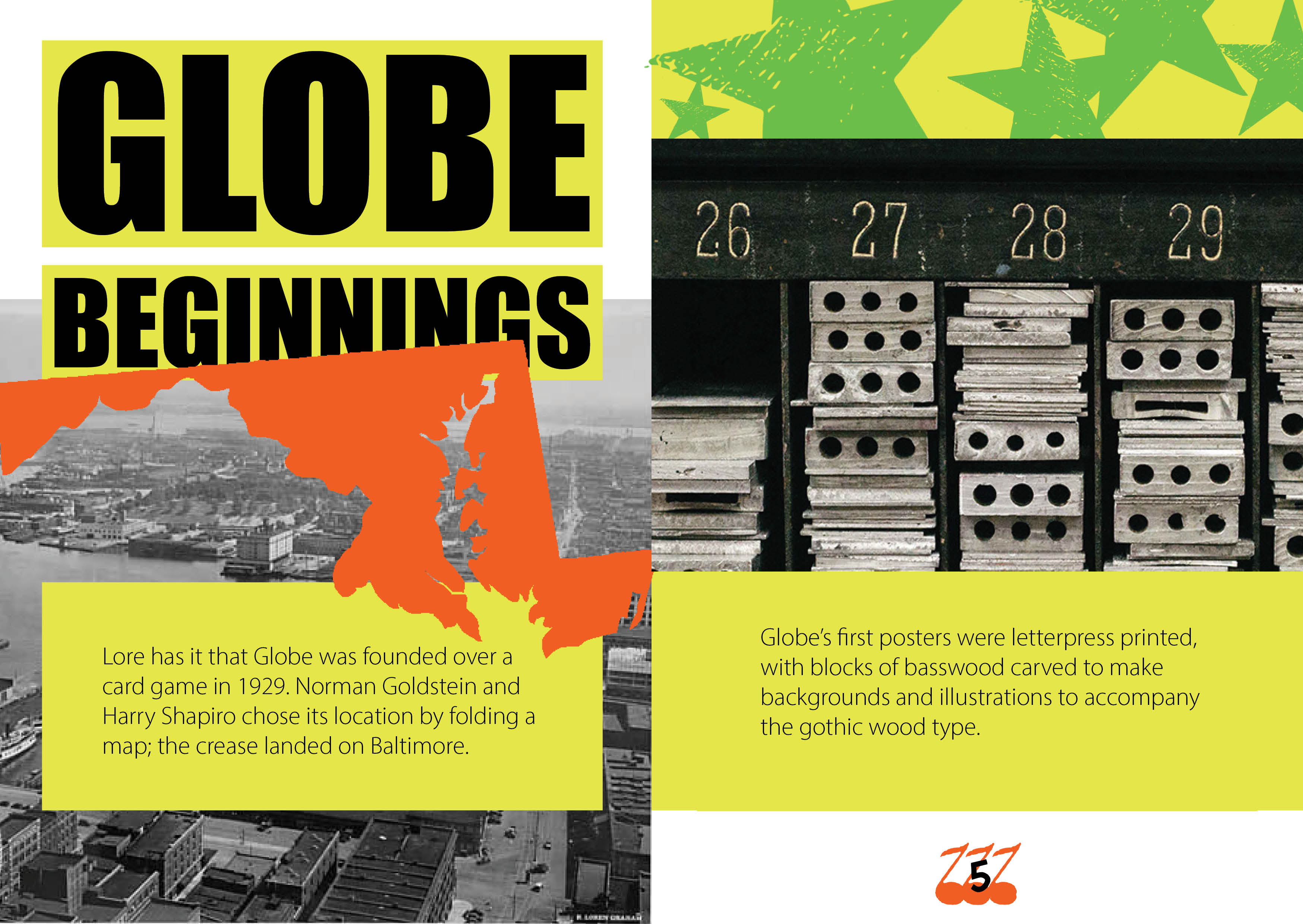
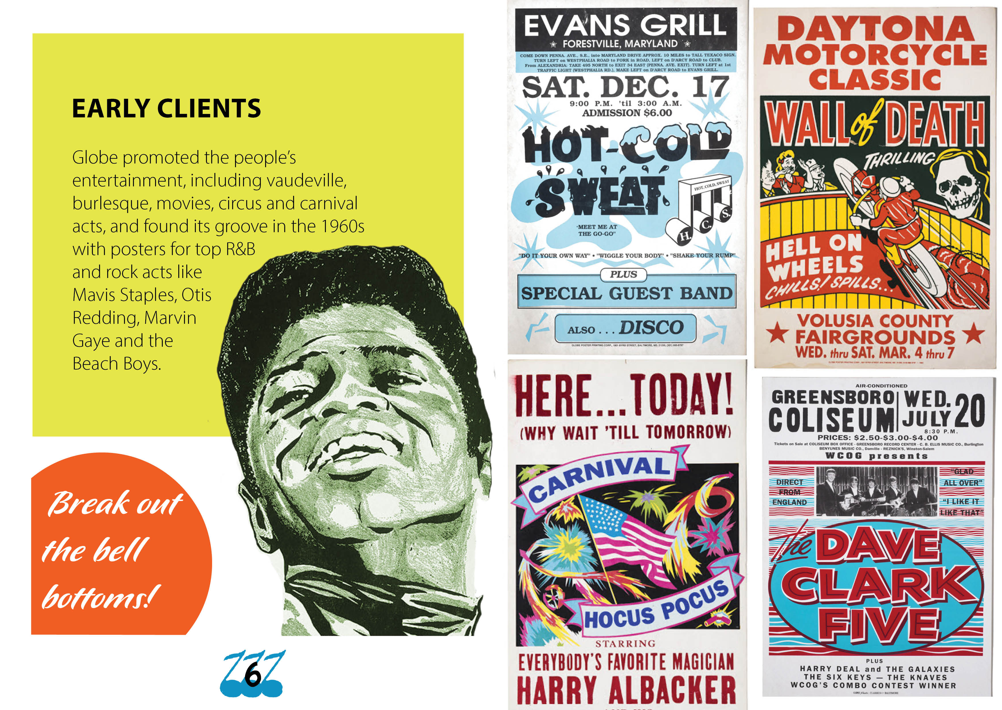
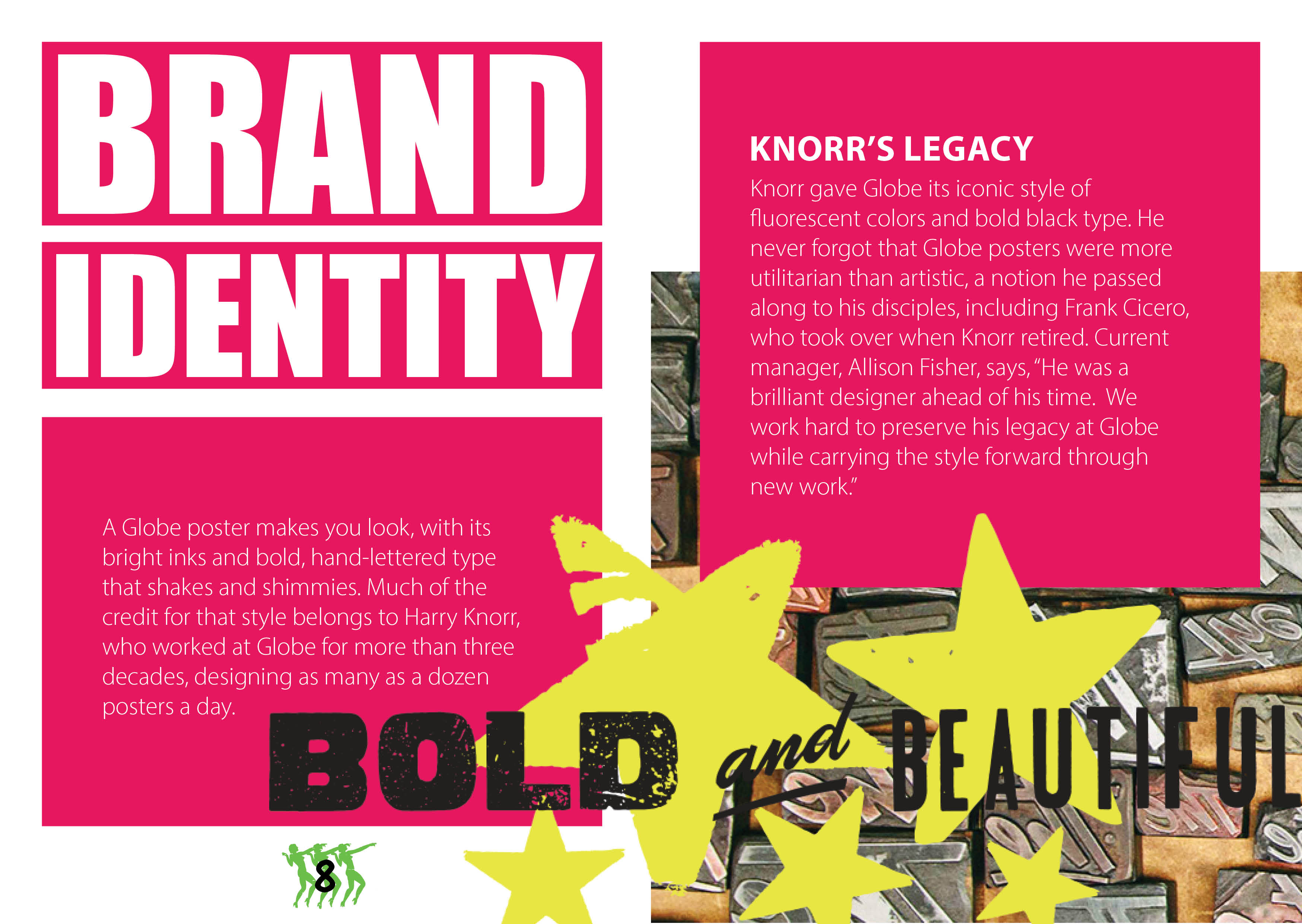
The second part of my research involved emailing with Allison Fisher, the manager of Globe. I asked her a few questions about Globe’s recurring events, relation to student life, philosophy, and plans for the future. Her responses provided me with quotes and facts to use in my booklet and also helped me determine which aspects of Globe’s business I should highlight, such as Harry Knorr’s legacy and Globe’s pro-vote campaign.
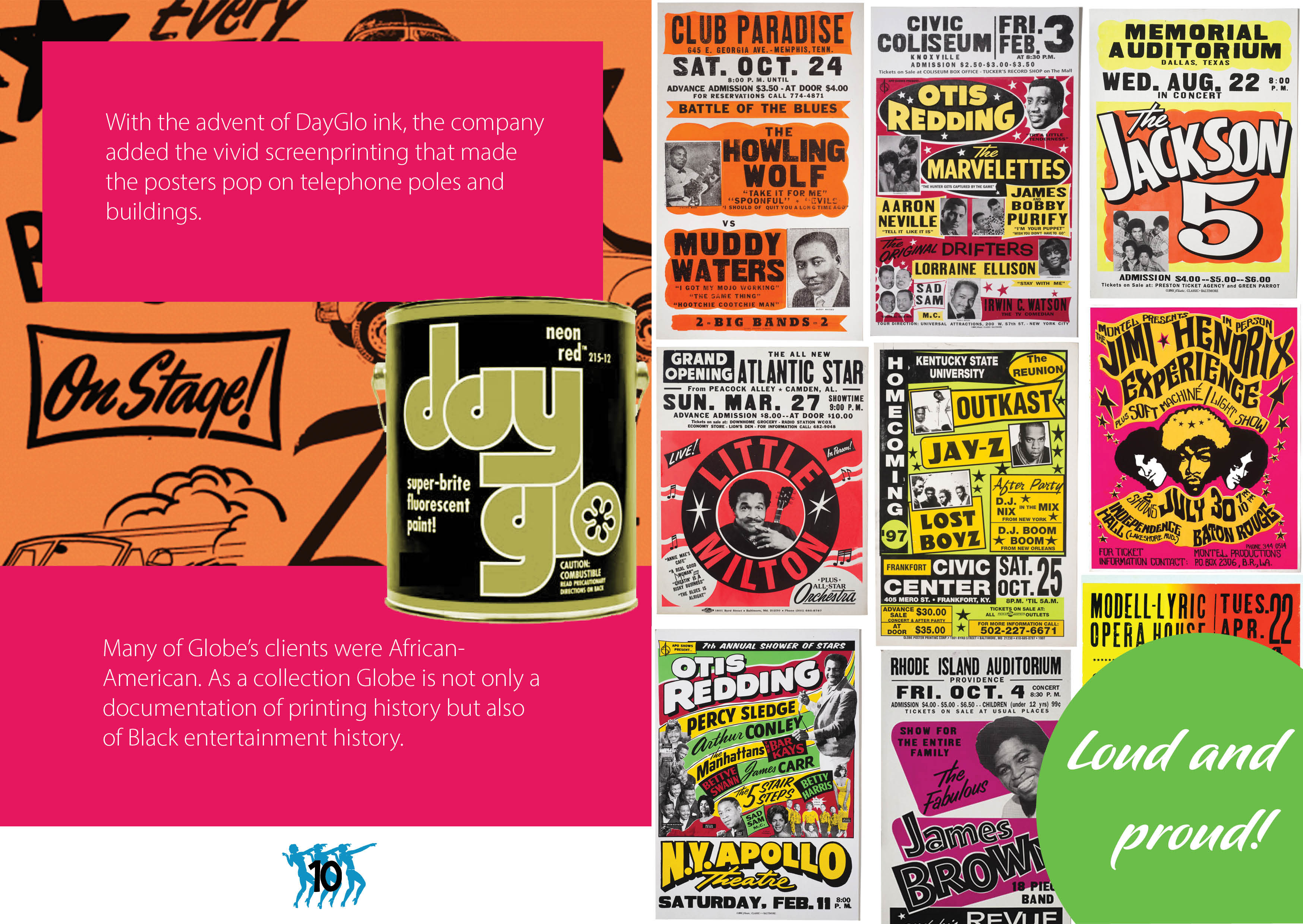
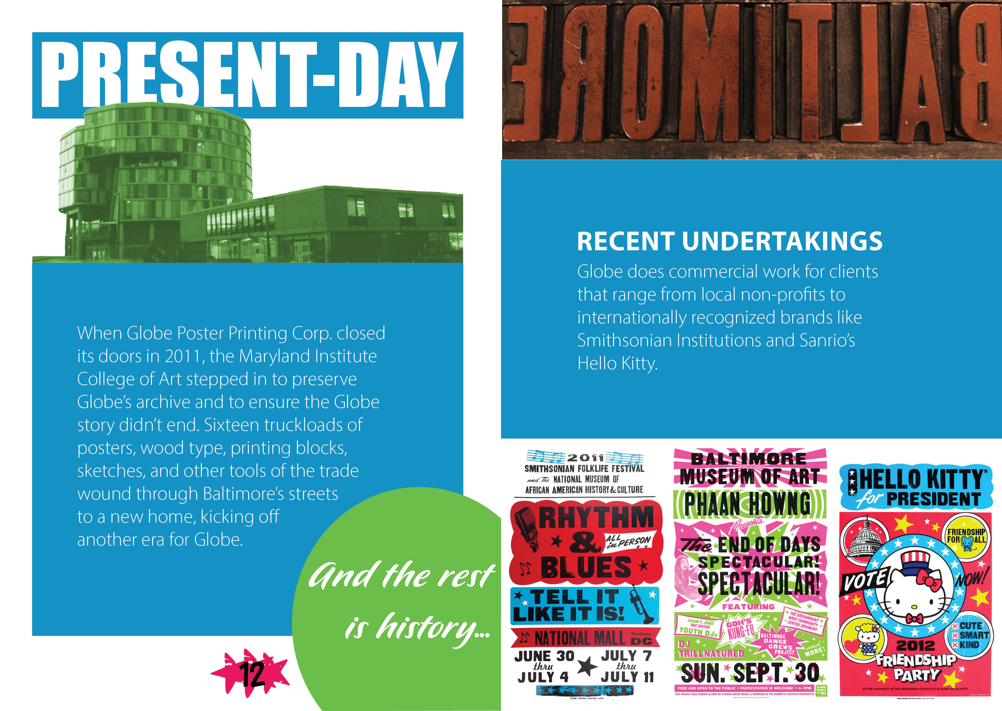
I used Globe’s posters as the foundation of my booklet design. At the beginning of my design education, I've been encouraged to simplify my designs and usually opted for minimalism. Globe's larger-than-life identity challenged me to embrace maximalism. I decided to blend my style with Globe's so that I could honor Globe’s grandiose aesthetic while keeping my design elegant.
In my initial sketches, I used four different fonts of varying sizes throughout my body paragraphs. I chose this unconventional style to resemble the bold nature of Globe’s posters. In later iterations, I modeled the design off of the body paragraphs on Globe’s web page, with just one font on a block of color with thick margins. This decision shifted the emphasis away from the body paragraphs and onto the posters, allowing the visuals to speak for themselves.
If I have the chance to spend more time on this in the future, I hope to construct each heading out of Globe’s wood type. I’d also add more hand-printed forms, like the green stars on page 5. Incorporating similar hand-printed elements throughout the booklet would make it much more cohesive and rich.
I loved getting to know the Globe Collection and Press during this project. I’m happy with the way I translated their poster designs to a simpler but still vibrant booklet.


© Lorena Ianiro 2023